
Sublime Hues for Quiet Luxury Living
Today we explore color palettes for quiet luxury interiors, celebrating nuance, restraint, and enduring elegance. Expect practical guidance on undertones, light, finishes, and materials, plus stories from real spaces. Learn how to compose hues that feel collected, layered, and beautifully calm without sacrificing richness, personality, or a sense of lived-in sophistication.

What Quiet Luxury Looks Like in Color
Quiet luxury is not about minimal color; it is about intentional color. The focus shifts from loud saturation to refined depth, subtle temperature, and tactile warmth. We look at undertones, light reflectance, and the quiet tension between neighboring hues that yields serenity, longevity, and an unmistakably elevated atmosphere.
Building a Timeless Palette
A lasting palette begins with a character-rich neutral, expands through neighboring tones, and concludes with accents that feel inevitable. Think in families rather than isolated swatches. We pair temperatures thoughtfully, protect subtle contrast, and honor patina so the space can age gracefully without feeling dated or over-styled.

Daylight and Orientation
North light cools and clarifies, favoring warmer neutrals; south light warms and saturates, tolerating cooler grays. East gives gentle morning brightness; west delivers amber drama. Sample on multiple walls, observe across hours, and note how undertones subtly tip under changing daylight before committing to your final scheme.
Artificial Light and Dimming
Select layered lighting with high CRI lamps to respect pigment integrity. Warm-dim LEDs mimic candlelit softness, flattering earthy palettes. Cooler task lights stay focused on function. Balance sources at different heights so evening scenes feel orchestrated, allowing textures and finishes to maintain presence without color drift or harshness.
Texture, Pattern, and Finish as Color
In quiet luxury, texture is an equal partner to color. A boucle sofa can cool a warm palette; silk drapery warms a cool gray. Subtle pattern and nuanced sheen add chromatic impression without actual pigment, amplifying depth while preserving the calm cadence that makes rooms feel naturally composed and lived-in.
Case Studies in Quiet Opulence
Stories anchor principles. These projects reveal how restrained palettes carry feeling: grounded mornings, flattering evenings, cohesive seasons. Note how neighbors on the color wheel build trust, and how texture replaces volume. The results feel inevitable, not contrived, inviting long-term comfort and subtle delight day after day without fatigue.
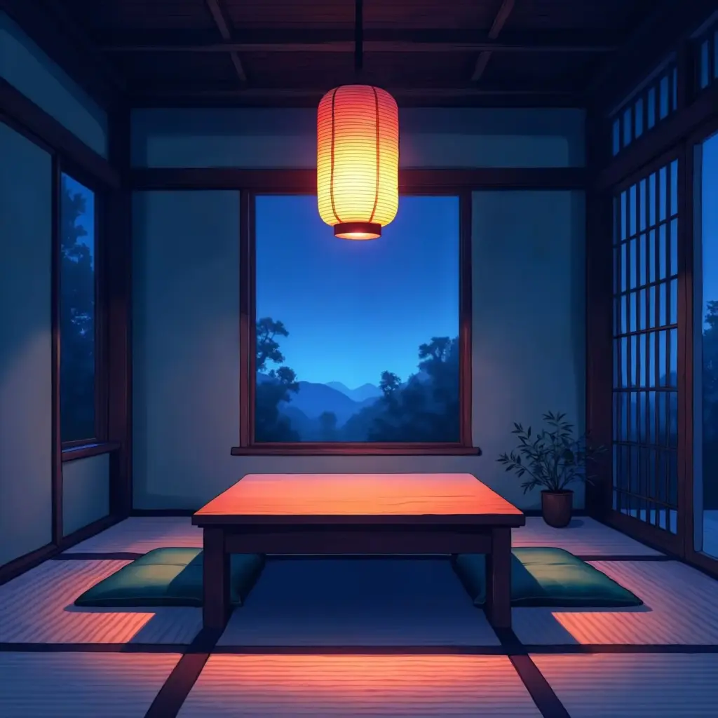
Urban Penthouse in Winter Neutrals
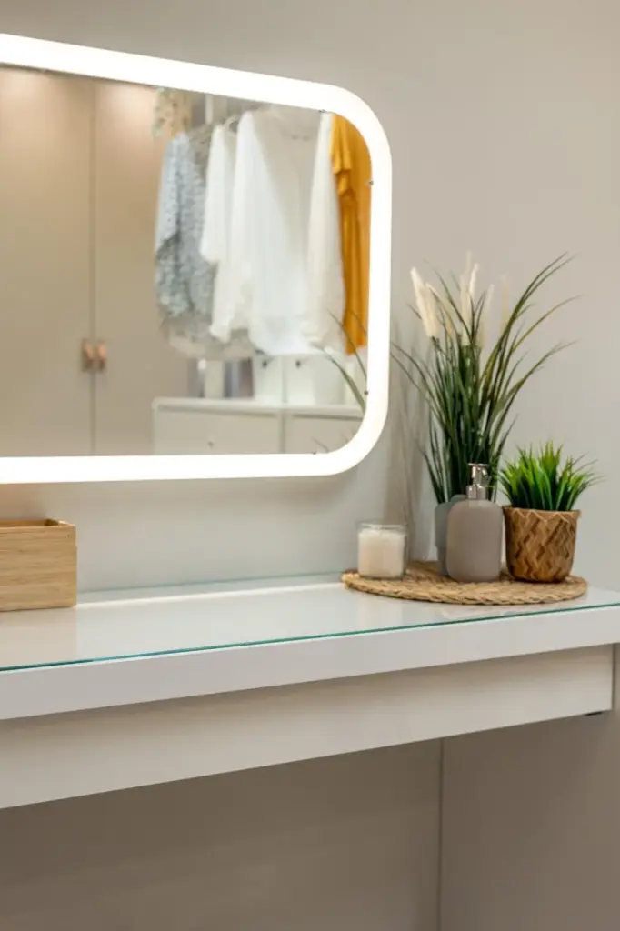
A skyline apartment adopted stone gray walls with a brown-violet undertone, deep walnut millwork, and brushed bronze accents. A smoky blue cashmere throw repeated on dining upholstery connected zones. Under warm-dim lighting, the palette softened, reflecting city lights while guarding calm, creating sanctuary above the street’s flicker and noise.
Coastal Retreat in Mineral Blues
Instead of cliché nautical brights, we layered foggy blue-gray, salt-washed white, and weathered oak. Soapstone counters echoed the water’s slate moments. A sea-glass green found life only in glassware and a linen stripe. Summer glare felt softened; winter storms read poetic, holding intimacy without losing the coast’s airy spirit.
Historic Townhouse in Tea Tones
Plaster skim with tea-tinted limewash bridged original millwork and modern furnishings. Mushroom, camel, and bitter chocolate progressed gently from hall to salon. Antique brass hardware and parchment shades supplied glow. Visitors noticed calm first, elegance second, and only later the quiet choreography of undertones keeping disparate eras in conversation.
Testing, Sampling, and Communication
Elegant palettes emerge through disciplined testing. We build boards, paint swatches at scale, and photograph under various lights. Notes track undertone shifts and sheen behavior. Collaboration with craftspeople ensures finishes land precisely, turning a beautiful concept into a livable, lasting color story that resists trend fatigue and seasonal swings.
The Sampling Ritual
Brush large swatches on primed boards, not tiny chips. Move them through rooms and across hours. Pair with actual textiles, stones, and metals. Record Kelvin, CRI, and weather notes. Only after living with samples for days should final selections settle, avoiding rushed choices that unravel calm later.

Workshops With Stakeholders
Gather decision-makers around a single table. Build shared vocabulary: warm-cool bias, chroma, LRV, metamerism. Compare candidates against anchor materials, then pre-visualize with scaled elevations. This process invites ownership, reduces revisions, and keeps the palette coherent from concept through installation, respecting texture, light, and the home’s daily rituals.
Join the Conversation and Keep Exploring
Color becomes richer when shared. We welcome your observations, experiments, successes, and near-misses. Ask questions, compare notes on lighting, and tell us which undertones surprised you. Your insights help refine methods, reveal regional differences, and build a resource that keeps quiet luxury generous, practical, and deeply personal for all.
All Rights Reserved.